The Challenges
Most of Telkomsel’s customers are still paying their bills and buying packages through third-party services and UMB which effectively cuts down on Telkomsel’s overall revenue.
Most customers are either unaware of or doesn’t care for Telkomsel’s other service offerings and their benefits.
My Role
I led the run team that was assigned this ambitious project to unify all of Telkomsel’s diverse service offerings and redefine a more coherent digital customer experience for the biggest telco provider in Indonesia. The core team consists of 2 UX Designers, 2 Visual Designers, 1 UX Researcher, 1 Project Manager. I also worked alongside our content strategist and business team to ensure a well-rounded product strategy.
Research & Fact-finding Process
Primary Research
The first thing that we did was to find out as much as we can about MyTsel’s core target customer specifically; their perception of the product’s value proposition, their goals when using the product, how they accomplish it and how they feel about the entire experience.
Because of the sheer number and diversity of Telkomsel users across the country, we decided to approach this stage with both qualitative and, with the help of Telkomsel's Customer Insight Team, quantitative methods.
Focus Group Discussions & Concept Testing
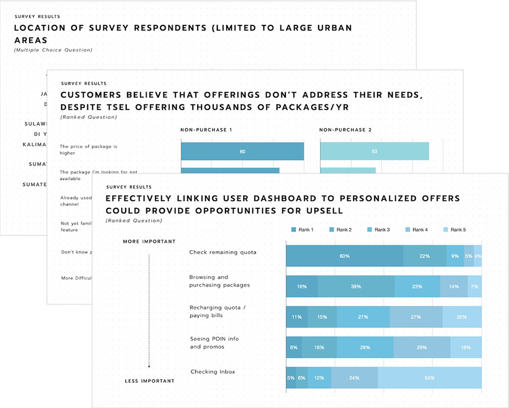
Package Purchase Telkomsel Survey Report 2018 (Sample)
Secondary Research
Along side our user research, we felt it was important for us to understand how our competitors behave and identify existing gaps in the market. Because of this, we also conducted a benchmarking exercise and used comparative feedback review of our direct competitors.
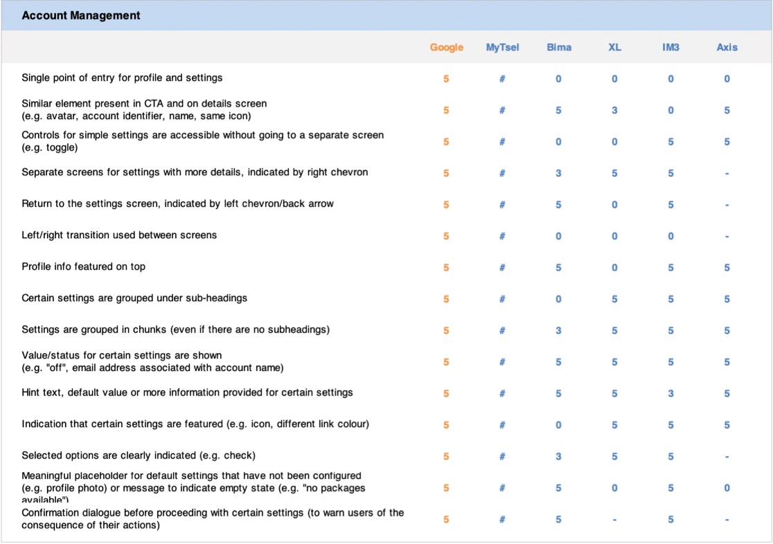
Benchmark Analysis (Sample)
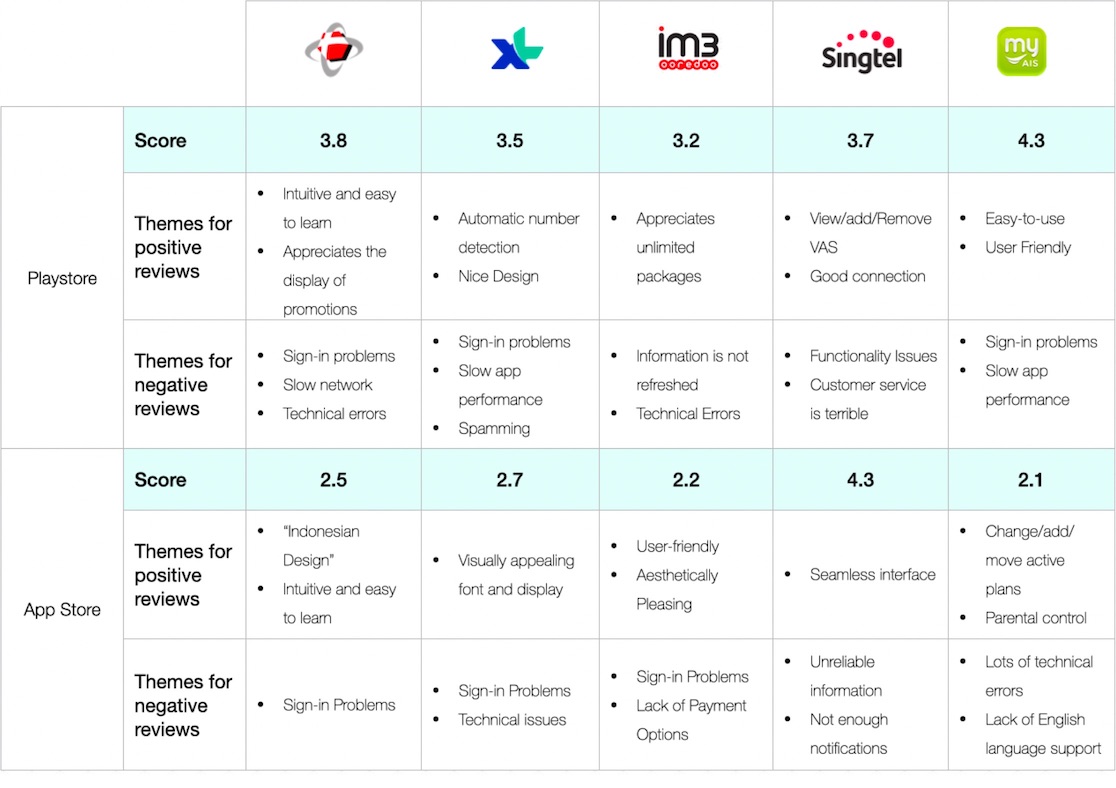
Telco App Store Rating Review, 2018 (Sample)
The Insights
Most customers struggle to find the app value proposition compelling
Customers don’t feel there is a need to use the MyTsel app over other more convenient methods. Their goals only revolve around addressing basic utilities such as buying packages and checking their usage. Customers don’t feel that the effort of downloading another app is worth the actual benefit.
Communications with customers have lost its meaning
Customers feel overly communicated to from the app. They receive so many notifications for promotions or campaigns that they see it as spam. Most of these messages are deleted before they’re even opened and create an overall negative sentiment for the app.
Most customers don't find Telkomsel’s other service offerings to be relevant to them
Over 70% of users rarely or never check for other packages/services despite Tsel offering thousands of them per year. Most customers are aware of core services offered (loyalty programs, tcash, etc) but are confused about how they work.
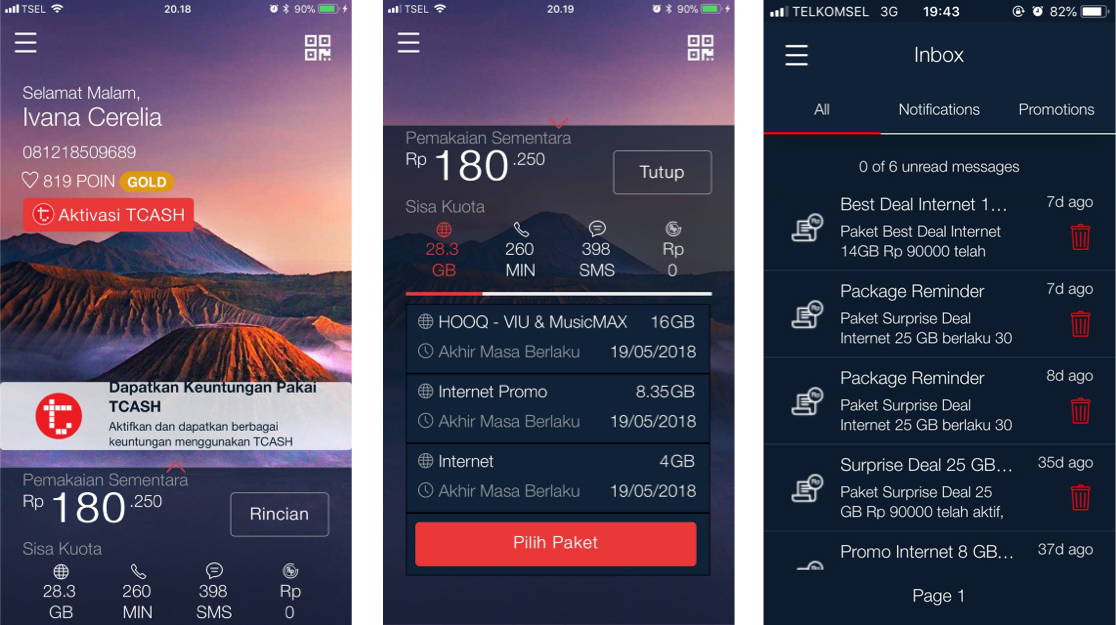
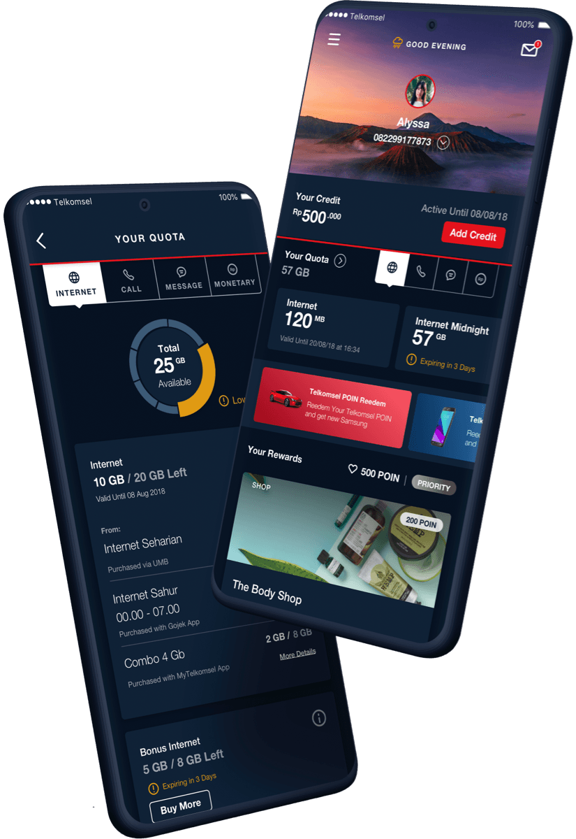
Initial App Design
Design Process
Design Goals
After gathering all the insights and having a deeper understanding of all the challenges our users face when using the app, we began conceptualizing possible solutions, focusing on quick flows and wireframes so we can iterate faster through ideas. The main product goals that we wanted the new design to achieve was:
Elevate Account Management
Telkomsel’s customer want to first and foremost see the things that matters to them. Managing their account is the core of what they need and the app needs to be the best way for them to accomplish this goal.
Encourage Exploration
The old design didn't really offer an easy way to explore all that Telkomsel has to offer. As such users are unaware of other offerings even when it provides better value. We wanted to open up the app design so that users have an easier way to see all of their options and hopefully, in the long run, be able to make better purchase decisions.
Personalize The Entire User Experience
The main value that the app could provide over UMB and third party services is personalization. One of the biggest pain-points that we uncovered through the research is that customers find that 90% of Tsel offerings are irrelevant to them. Personalization is the key that's going to decide whether or not customers find value in using the app.
Card Sorting Exercise
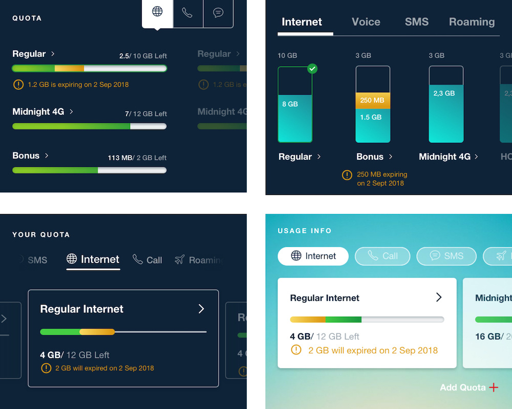
Quota Tracking Design Exploration
Stakeholder Management & Value Curation
One of the biggest issue that we found in the old app was the sheer number of hidden features inside the app. Random mini-games can be found burried deep in the navigation structures, there were features that 99% of the users we tested have never seen before.
The reason for this was all the different stakeholders and business units will have feature ideas and request for them to be implemented in the app. This was a big hurdle to overcome, getting all the stakeholder in the same page with everyone fighting over what is considered prime “real estate” within the app.
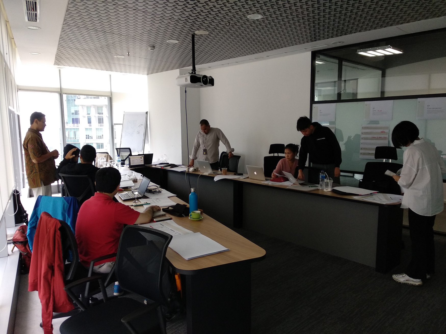
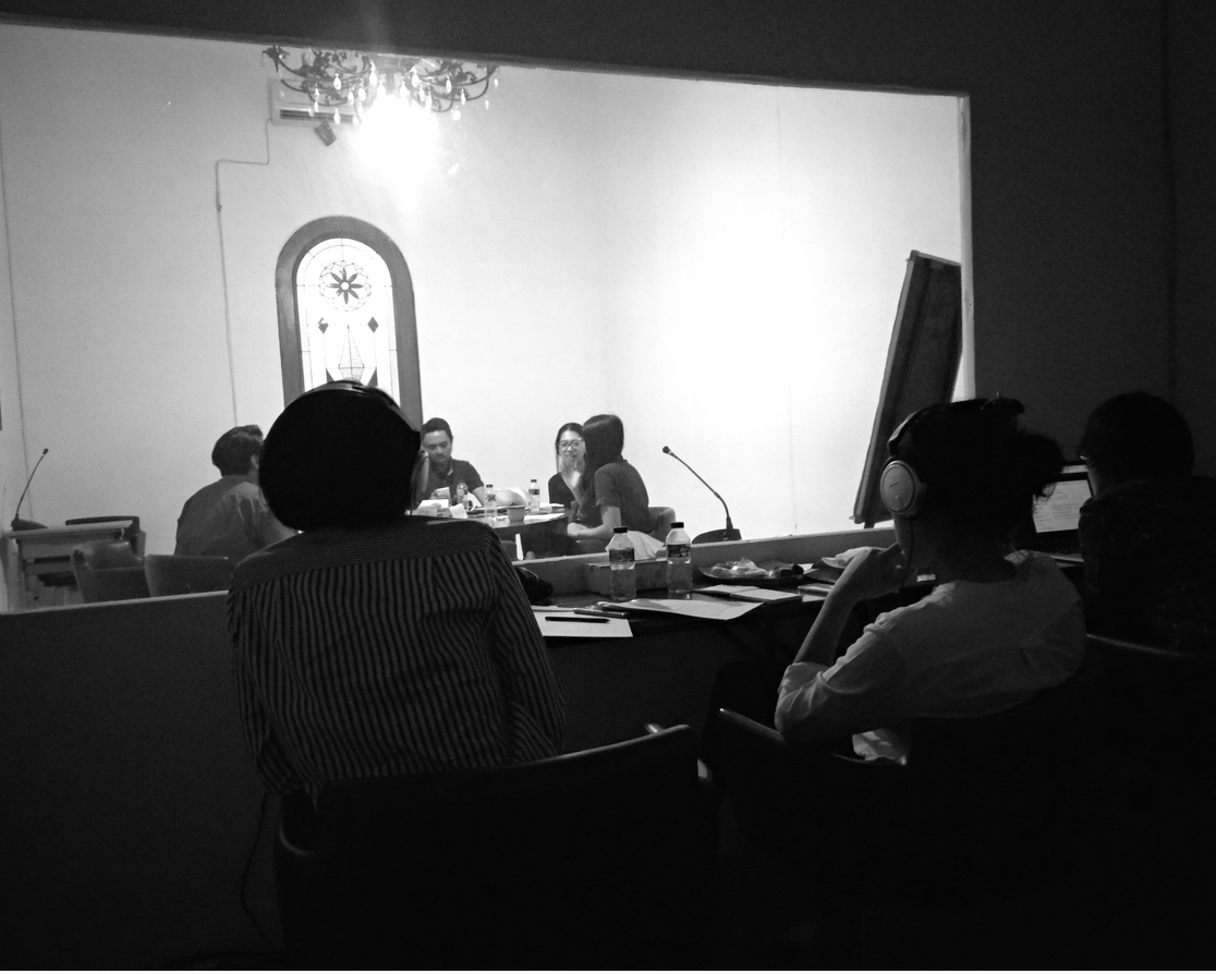
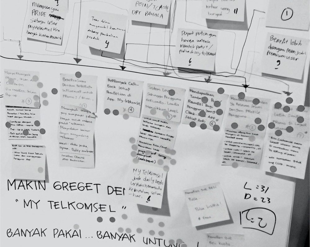
One of the many, many stakeholder meetings we held to try and get everyone on the same page
To try and counter this issue, we decided to invite key persons from different departments to participate in a prioritization workshop with real users. The idea was to get all of the stakeholders to rank the features that they find most important for their individual business units and compare them to what real users will find most valuable
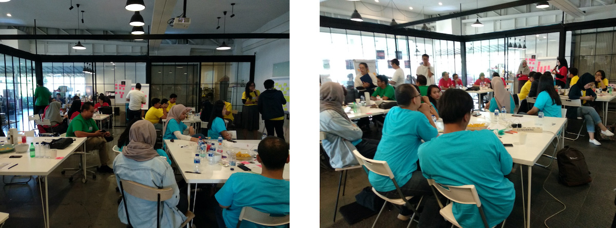
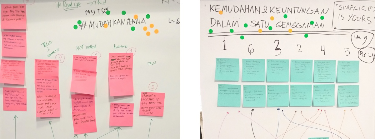
I think the result of the workshop was really eye-opening and refocus the discussions based on user needs and wants. Through the workshop we found out that users will filter features through their own value lens based on the goals that they want to accomplish. These primary values are:
Track
Usage, quota, transactions, etc
Start / Stop / Continue
Services, subscriptions, packages, etc
Learn
Ask Questions
Solve / Mitigate Issues
Get rewarded
These value lenses gave us a way to curate all of the feature and service offerings in the app. Features that doesn’t help users accomplish at least one of these goals will be removed and replaced with features that does.
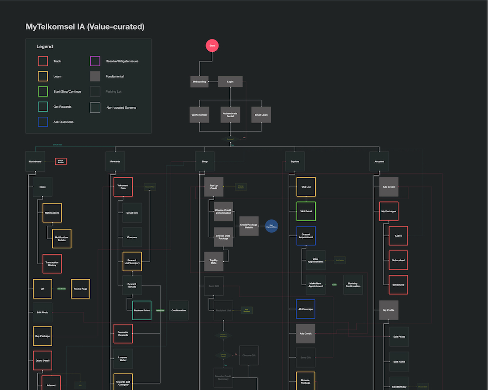
App Information Architecture
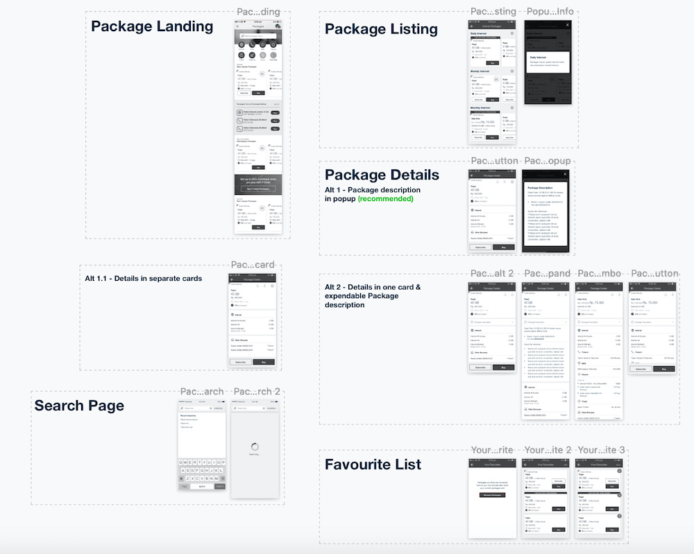
Wireframe (Sample)
The Final Product
With this project, we basically rebuilt the entire MyTsel user experience from the grounds up. The end result was perhaps the most radical update that Telkomsel has ever rolled out (at the time of the launch).
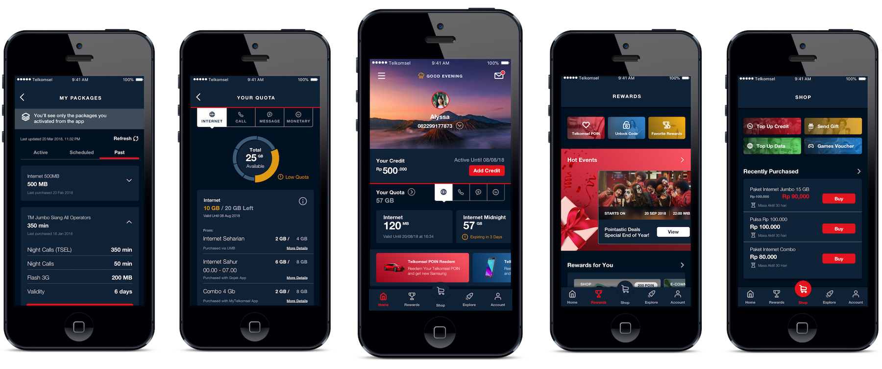
At the end of the day, while there are still a lot of room for improvements, we accomplished most of the design goals that we wanted to achieve with this iteration. Some of the design decisions that I want to highlight:
The core value of the product is still account management, the home page shows all the relevant information regarding quota and usage. But if the users want to know more details about each usage category they can now do that as well.
We opened up the navigation to make it easier for users to explore all the different services that Telkomsel has to offer. This will go a long way to to increase the app’s user engagement and retention.
We also added a lot of room for personalization across all section of the apps. New offers and promos will now be tailored specifically to that particular user. On the other hand, we’ve also made it easy for users to repurchase packages and services that they used in the past.
Overall I think we’ve given the user a more engaging way to explore the breadth of Tsel’s many products and service offering.
The Impact
The redesign of the MyTsel app on iOS and Android has had an overall positive impact on the app experience. While the new version tested well amongst the 18-35 demographics, feedback and analytics from older demographic has indicated that they prefer the more straight-forward design of the old version. Some highlights:
Average app-store rating for the new version is 4.1 up from 3.1 across both app stores.
30 million average MAU (2019, active year) up from 18 million the previous year.
16.2% increase in revenue generation, based on 12 months post-relaunch revenue change.
Final Note
This case study was created to describe the work that I did with Telkomsel. For both brevity and ethical considerations, I have omitted and redacted some details and timeline surrounding the project.
I left the project around 3 months after the launch of the app, the results and impact data are all based on second-hand information and marketing materials released by both Sapient and Telkomsel post launch.
Finally, I would like to say a special thanks to the team who worked on this project with me, without their great ideas and hard work this project would have been literally impossible to tackle.